COLOURING THE CONDO....PART 1
Last week I went to Toronto to move some items into our newly purchased condo. I was also there to choose new colours for the entire space. I was particularly excited to explore colour options because I had taken Maria Killam's True Colour Expert training course in early June. I love colour, always have, but I realized that I was weak when it came to choosing colours for difficult spaces...spaces where as Maria would say the "bossy" and perhaps existing fireplace, floor, counter, backsplash or wood trim is preventing wise colour choices from being made. The key to choosing colours correctly in this case is to examine the undertones. Determining undertones in colours, especially in existing 'can't change them' colours, is essential in order to wisely decide on new colours that should enhance, not fight with the space.

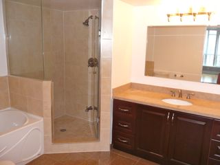
I realized, with my newly acquired knowledge of colour and undertones that I would find the perfect colour to complement the existing and permanent pinky beige in the two bathrooms. Armed with my new 50 large Benjamin Moore neutral colour samples that I ordered from Maria, I was able to quickly determine, through the process of elimination and comparison that Bradstreet Beige HC-48 was THE perfect colour choice for each bathroom. Maria, I'm certain would agree.

The painters will be finished painting this week and I will be going back next week to try and complete the set up, or at the very least make it habitable for the family members who will be living there.
Stay tuned for the continuing saga of how I chose the remainder of the colours, and how I managed to decorate the condo on a budget.
posted by Maureen @ Modecor @ Tuesday, August 23, 2011
7 Comments
![]()


7 Comments:
Oh I love a paint makeover. Sounds like you've got the colours all sewn up and I'll be waiting for the beautiful after photos!
That looks like the perfect choice! Eagerly awaiting transformation photos! ;)
Thanks ladies...taking longer than I thought due to distance. Another SUV load and more deliveries next week.
Terrific Maureen!! Will you incorporate accent colours in the bathrooms? Now that you've created the perfect neutral foundation through a colour that compliments the bossy tile, you have more accent colours you can go to! Lotsa fun!!
Victoria
P.S. I took a full semester colour course taught by Maria at a local college...fantastic! I would imagine she's refined things for her fabulous True Colour Expert training program though. Lucky you!!
Yes Victoria., can't wait to get the right accent colours in the bathrooms...they need it ..but my clients are my two daughters so I have to consult and nudge them in the right direction. I really enjoyed Maria's course and the large paint chips are worth every cent. I was able to show my daughter and the painter why the colours I chose were the right ones. They could SEE it.
So awesome Maureen! Love this post! You are so beautiful too by the way!
xo
Maria
Based on the pictures you posted, Bradstreet Beige looks like the perfect colour :-) Can't wait to see how the bathrooms and the rest of the condo turn out!
Post a Comment
Subscribe to Post Comments [Atom]
<< Home